3× conversions from one broken form field
The brief was to redesign the platform. The real problem was a single broken form field nobody had caught. Finding it first (before touching any screen) was the decision that made the difference.
The right diagnosis is faster than the most thorough redesign. A funnel audit before any design work tripled conversions without rebuilding the product.
Product Snapshot
This case study documents a funnel audit that traced a conversion problem back to a single broken form component, not a traffic or budget issue, as marketing had assumed. In two weeks, lead conversions tripled. The hardest problem wasn't the redesign itself, it was convincing finance that fewer form fields, not more ad spend, was the actual fix.
Context
Automotive lead-generation funnel
Paid traffic campaign with rising ad spend and flat conversions.
Problem
Conversion loss with no clear cause
Marketing assumed a traffic issue; the real cause was one broken mobile form field.
Solution
Root-cause audit, then redesign
Diagnosed the failure before touching the UI, then rebuilt the form around real mobile usage.
Role
Senior Product Designer
Funnel audit, stakeholder alignment, and form redesign.
Team
Marketing & Finance stakeholders
Aligned on removing fields based on evidence, not habit.
Outcome
3× lead conversions in two weeks
Delivered end-to-end in 14 days, from diagnosis to production.
Scope
Funnel diagnostics
Audit, stakeholder alignment, redesign, and post-launch tracking.
Context
ClikAuto is one of Mexico's leading automotive financing marketplaces. A platform where buyers research vehicles and submit loan applications before connecting with dealerships. The business model is direct: qualified lead volume drives revenue.

In Q3, the marketing team increased its budget by 25%, expecting proportional lead growth. Conversions stayed flat. The disconnect triggered an escalation that started as a marketing problem and ended as a product problem.
The trigger
Every morning in sales meetings, the same question: 'Why aren't we generating more leads if we keep increasing spend?' Nobody had data to answer it. That was the real starting point.
Investigation
Before forming any hypothesis, the investigation needed to locate exactly where in the funnel the breakdown was occurring. The business assumed the problem was in the ads. That assumption had to be tested, not trusted.
Days 1–2
Instrumentation
Hotjar + session recordings installed
Days 2–3
Observation
Behavioral pattern analysis
Day 3
Friction audit
Drop-off point mapping
Day 4
Alignment
Stakeholders + minimum viable fields
Days 5–11
Design
Mobile-first, step-by-step
Days 12–14
Delivery
Handoff + QA + production
Days 1–2
Instrumentation
Hotjar + session recordings installed
Days 2–3
Observation
Behavioral pattern analysis
Day 3
Friction audit
Drop-off point mapping
Day 4
Alignment
Stakeholders + minimum viable fields
Days 5–11
Design
Mobile-first, step-by-step
Days 12–14
Delivery
Handoff + QA + production
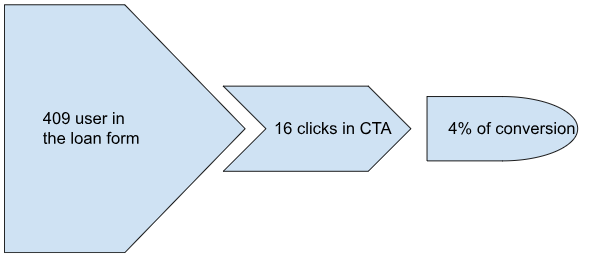
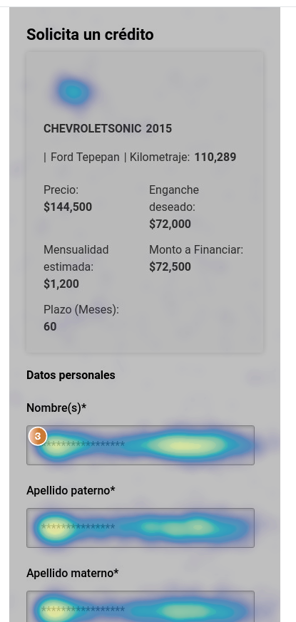
With Hotjar installed across the acquisition funnel, session recordings showed the pattern clearly: users were arriving with intent, navigating to the form, and abandoning silently. The landing page wasn't the issue. The form was.
| Funnel stage | Evidence | Finding | Implication |
|---|---|---|---|
| Incoming traffic | +25% ad budget, same click rate | More investment didn't improve conversions | Problem wasn't in traffic quality |
| Landing page | High scroll depth, uniform heatmap | Users reached the form with real intent | Problem wasn't the entry page |
| Form start | Session recordings: visible drop-off at fields 3–4 | Visual density causes immediate cognitive fatigue | Form architecture was wrong |
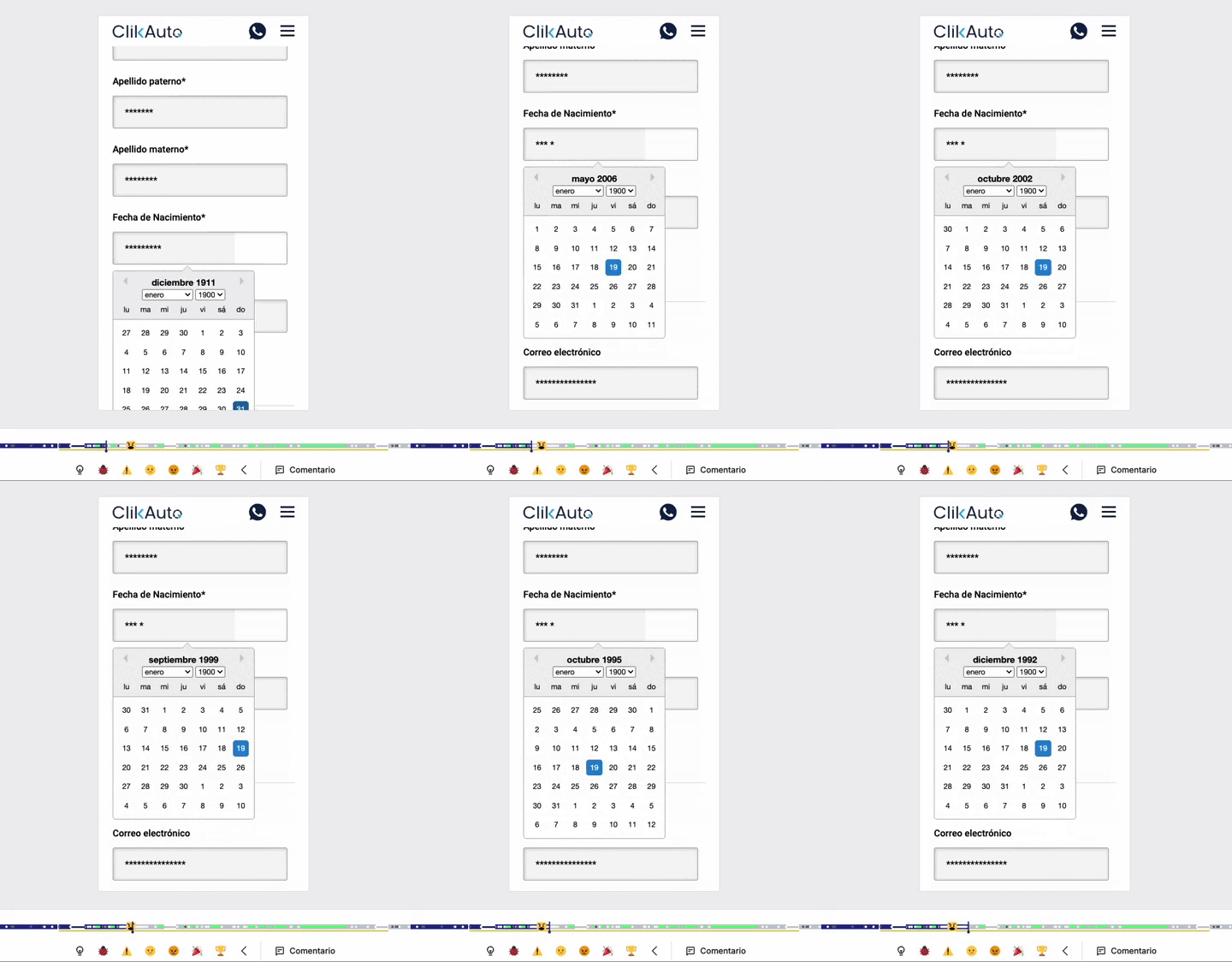
| Date selector | 76% of abandonment concentrated here | Component completely broken on mobile | One element was destroying the entire funnel |
| Form submission | 4% overall conversion / 95% mobile traffic | Desktop-first form, mobile audience | Structural product-user misalignment |
Traffic quality wasn't the problem. Users were arriving at the form with intent to complete it, but the product was pushing them out before they could.
76% of abandonment was concentrated in a single component: the date selector, which was completely unusable on mobile. One element was destroying the entire funnel.
95% of traffic was mobile, but the form had been designed for desktop. A main problem was a structurally incorrect product decision from the start.
The finance team was collecting more data than needed to qualify a lead. Form density was partially self-inflicted, fields added by habit, not by actual need.
Synthesis
The data confirmed three of four working hypotheses and invalidated the most important assumption: the problem wasn't in the campaigns. It was in the product receiving the traffic those campaigns were generating.
Synthesis revealed a deeper problem than a broken component. A single-page form asks the user to hold the full cognitive load of a financing application simultaneously, no guidance, no visible progress, no confirmation of advancement. Fixing the date selector would have reduced abandonment at that specific point. But the architecture problem would have remained.
““If you don't have information, you can't design solutions, intuition is not strategy. The three days we spent locating the problem saved us from two weeks of solving the wrong one.””
Joel Nápoles · Product Lead, ClikAuto
Design hypothesis
Splitting the form into sequential, guided steps with native mobile inputs and contextual micro-copy at each stage, would reduce cognitive load and transform silent abandonment into measurable, iterable friction points.
The hypothesis also had a more important business implication: a step-by-step form doesn't just improve completion rates, it creates a diagnostic infrastructure. Each step becomes an individual data point that enables future optimization with surgical precision.
Design
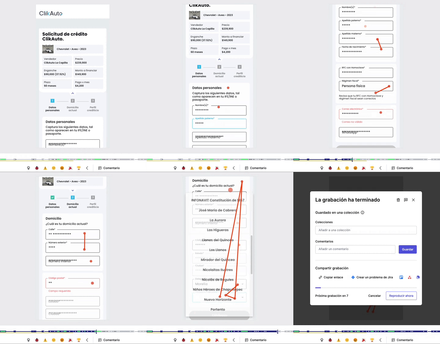
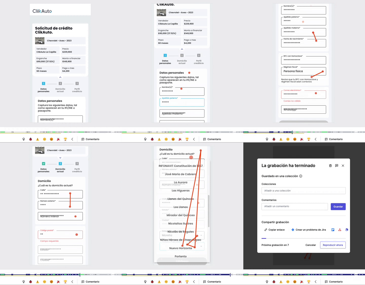
Three architecture directions were explored before converging on the final solution. Steps with contextual progress and per-field micro-confirmations, was selected: immediate field feedback reduces uncertainty on sensitive financial data, exactly the anxiety driving silent abandonment in the original form.
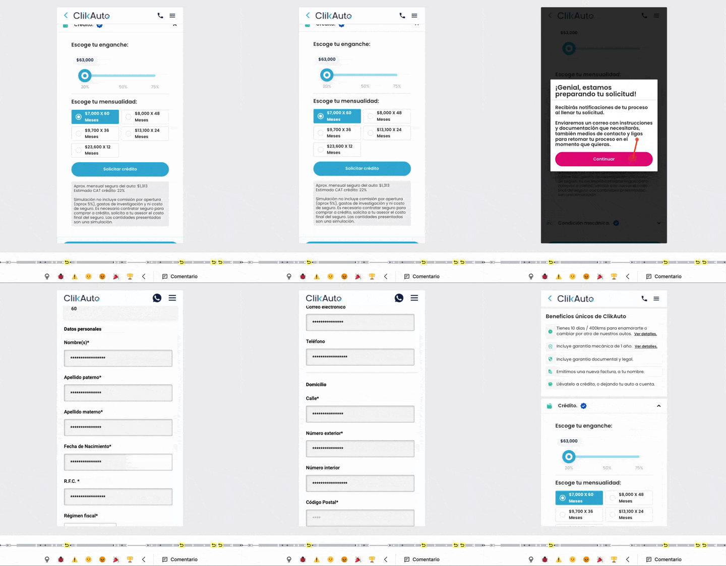
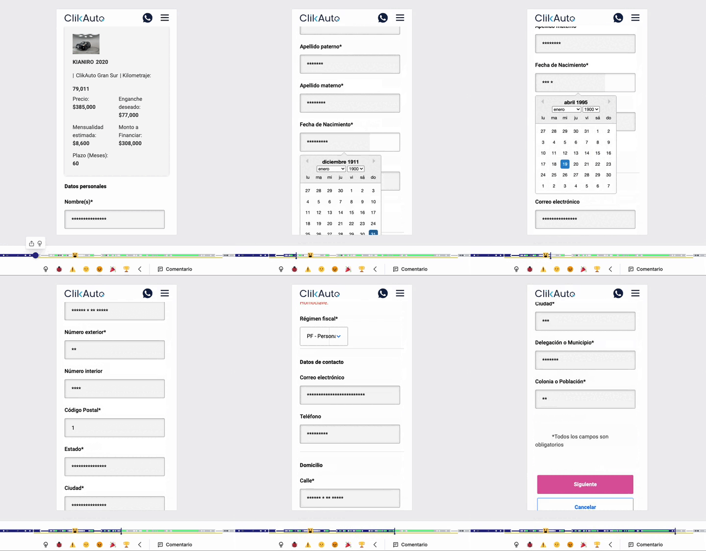
- Progress indicator: frames current position as advancement, not length: 'Step 2 of 5' not '4 steps remaining'
- Native date input: replaces the broken selector with the OS-native mobile picker, no external dependencies
- Contextual micro-copy: each sensitive field explains why the information is needed, reducing anxiety on financial and ID fields
- Back/forward navigation without data loss: users can correct answers without re-entering completed information
- Autofiled-inputs: Automatically fills in the next steps if the info matches something the user already gave.
Impact
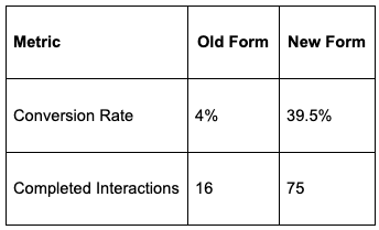
The redesigned form launched at the end of week 2. Results were visible within the first 7 days: conversions tripled the baseline, and captured data quality improved because the step-by-step format enforced structured completeness instead of partial submissions.
The marketing team, which had invested 25% more in traffic acquisition without seeing results, could attribute the increase directly to the product change, not to campaign variations. That shifted the internal conversation about where to invest in the next cycle.
The lasting impact
The most valuable result wasn't the conversion rate. It was the per-step visibility built alongside the redesign. For the first time, the team could see exactly where in the form users were dropping off, turning a black-box problem into an iterable diagnostic system.
Reflection
This project clarified something that becomes more evident with every product: the difference between solving a problem and solving the right problem is where most of the value of a senior product designer concentrates.
- Problem location precedes solution: the 3 days of audit before opening Figma were worth more than any individual design decision. Without that work, we would have optimized the wrong system with high execution quality.
- Constraints generate alignment: the finance team's data requirements forced a conversation that improved the product. Constraints aren't obstacles to product thinking; they're inputs that structure the problem.
- Speed tools accelerate execution but don't replace judgment: the audit framework, micro-copy, and component prototyping used available tools. The decision of which fields to eliminate required organizational context no tool could provide.
- Diagnostic infrastructure must be built alongside the solution: per-step tracking wasn't a nice-to-have. It was the mechanism that would make the result measurable and the next iteration possible.