One MVP, three realities
A doctor, a caregiver, and a patient don't need the same information and they can't use the same interface. One MVP handoff. Three completely different user types. Validated in 72 hours.
A system of adaptive complexity: each user sees exactly what they need, without the product collapsing under the weight of trying to serve everyone the same way.
Product Snapshot
This case study documents a 72-hour MVP sprint solving for three conflicting users in one app: a caregiver, a patient, and a remote family member. The problem was designing one architecture that could flex in complexity depending on who was using it.
Context
Remote health monitoring for elderly patients
Caregivers, patients, and family members needed very different things from the same app.
Problem
Three users, one product
A single interface risked serving none of the three well.
Solution
Role-based UI architecture
One shared system that adjusts complexity by user role at onboarding.
Role
Senior Product Designer
Research, personas, role-based architecture, and validation.
Team
Solo sprint, user-validated
Tested directly with real users within the 72-hour window.
Outcome
Validated MVP in 72 hours
Testing surfaced 2 features needing refinement before further development.
Scope
Concept-to-validated MVP
Research, personas, 4 core modules, and role-based screen design.
Context
Remote caregiving is one of the more emotionally demanding situations in modern healthcare. A family member managing the health of an elderly parent from a distance faces constant uncertainty. Did they take their medication? Was there an abnormal reading overnight? Is the emergency contact reachable?
Monitor was designed to reduce that uncertainty. The app collects real-time health data from everyday smart devices (phones, watches, smart speakers) and distributes it to the right people at the right time.
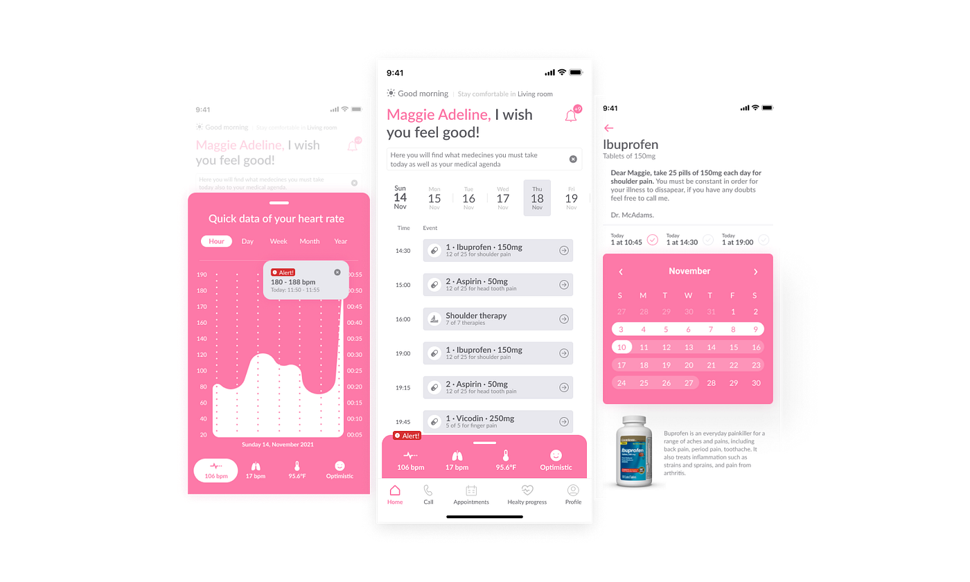
Problem
Three user groups had fundamentally different needs from the same product. Digital-native caregivers needed monitoring dashboards and alert configuration. Elderly patients needed radical simplicity and one-tap contact access. Remote family members needed reliable alerts without information overload.
“If users find a good path to solve all their needs quickly, the product will be adopted as a solution.”
The design challenge wasn't building three separate apps. It was building one coherent architecture that served three different people entering through different doors.
Research
User research surfaced three distinct personas, each representing a different relationship with the product and a different definition of what 'working well' meant.


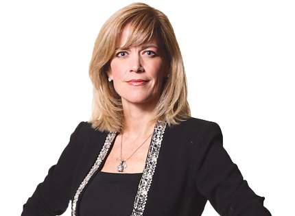
- Daniela (33) — needs medication calendar, emergency contacts, daily alerts, and real-time status
- Manuel (71) — needs pill reminders, simple navigation, basic health tracking with no complexity
- Emma (56) — needs notification-based awareness without actively checking the app
Design
Role-based onboarding configured UI complexity at setup. The patient view was radically simplified large tap targets, minimal decisions, clear hierarchy. The caregiver view surfaced the full monitoring dashboard, event log, and alert configuration.
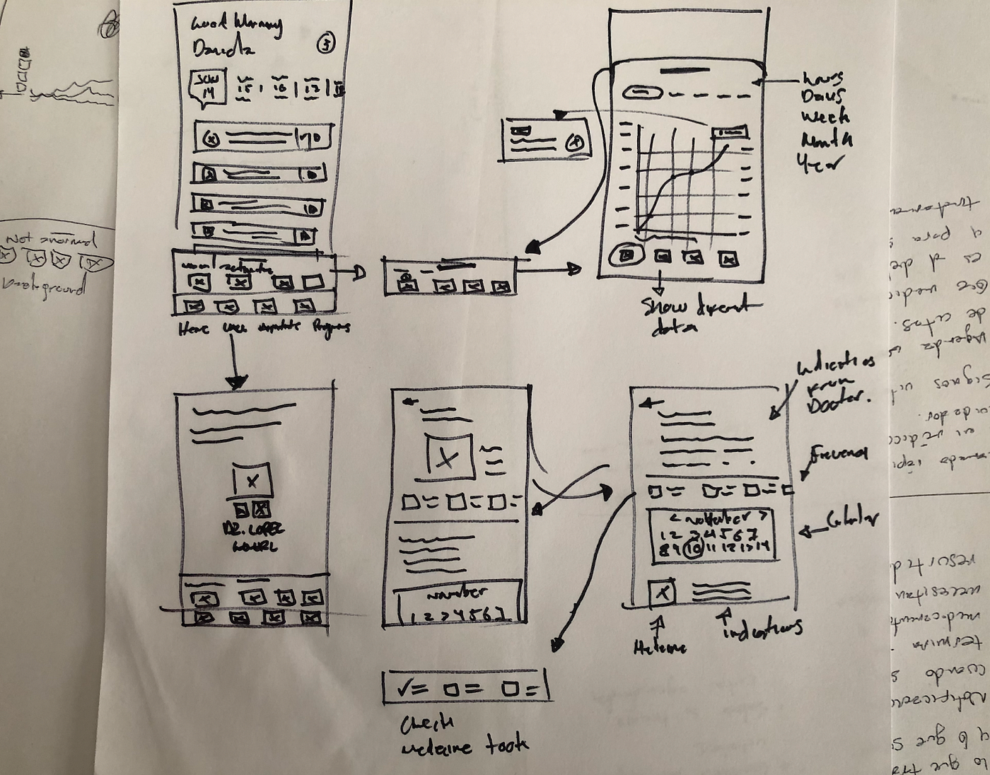
The color system responded to patient identity: blue for male, pink for female. A detail that reduced cognitive load when users configured their care profile at onboarding.
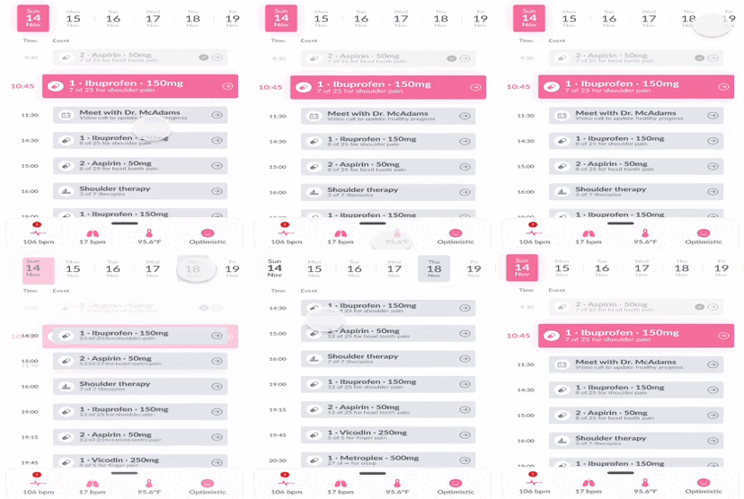
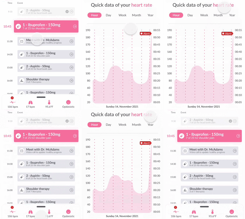
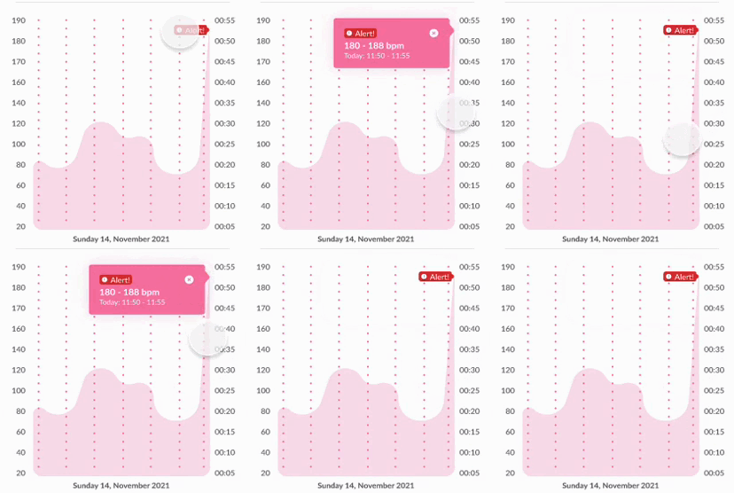
- Role-based UI configuration at onboarding: patient vs. caregiver view
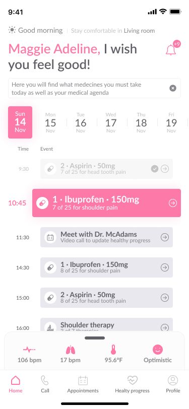
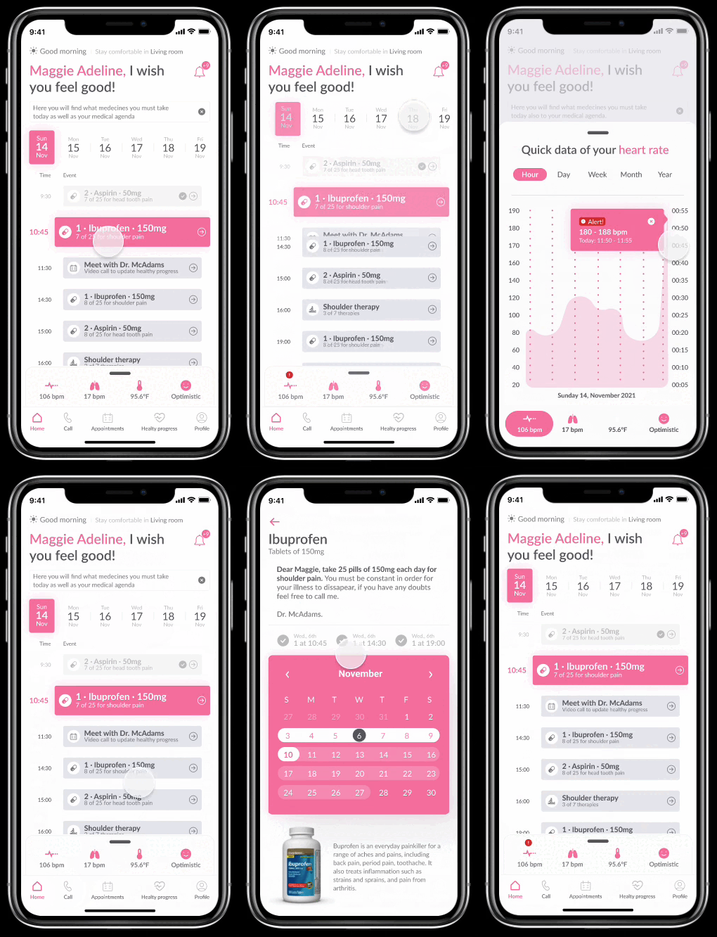
- Home dashboard: quick health summary, upcoming medications, recent events
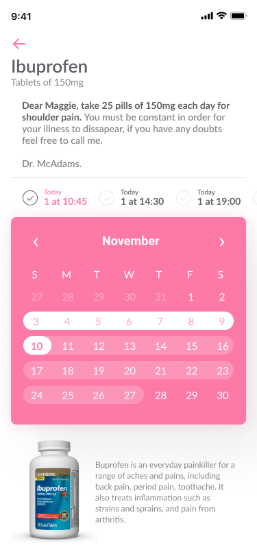
- Medication module: pill reminders with acknowledgment tracking for caregiver visibility
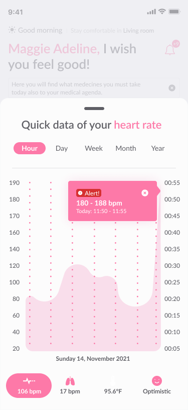
- Event log: real-time health anomaly feed with urgency levels
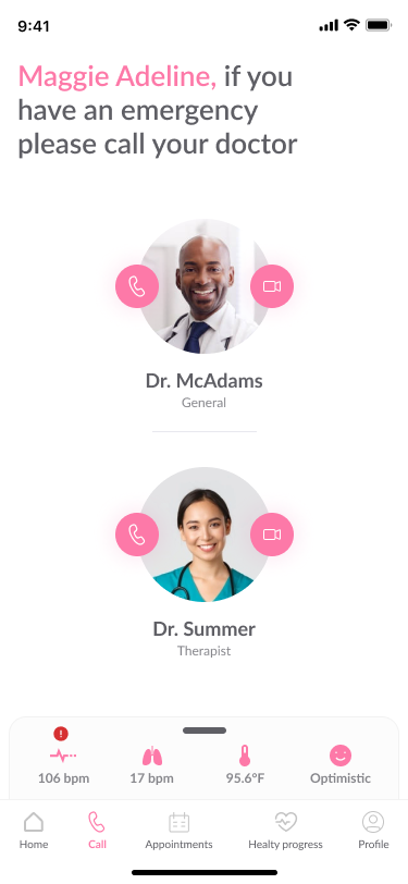
- Emergency contacts: always accessible regardless of navigation state
Mobile Screens
Four core modules: home dashboard, real-time event monitoring, medication schedule, and emergency contacts. Each module was designed with role-specific content density = simplified for patients, detailed for caregivers.
Outcome
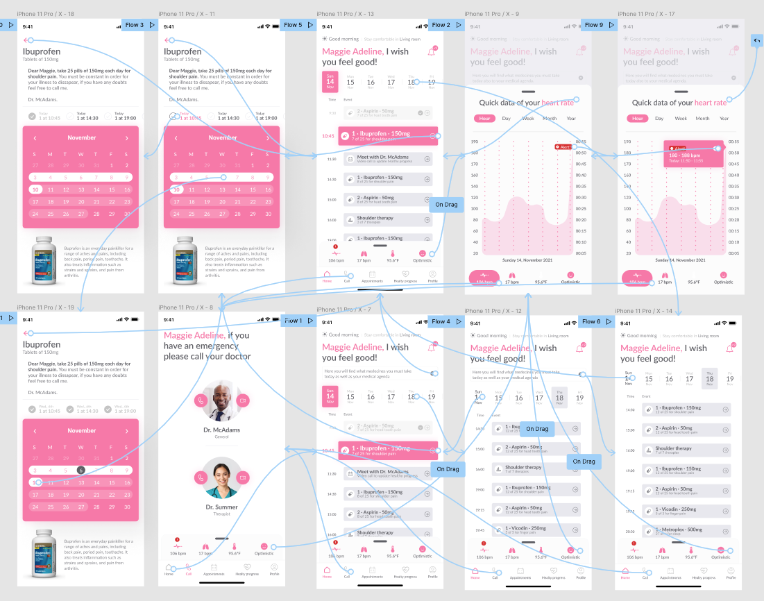
The functional MVP was completed in 72 hours and validated with real users. The prototype confirmed the role-based architecture worked as expected and surfaced two features that needed refinement before full development, which is exactly what an MVP should do.
Designing for mixed technical literacy in a single product is a systems problem. The interface itself can't be all things to all users, the architecture has to be. Role-based complexity configuration at setup unlocked a design space that would have otherwise required multiple separate products.