Autonomy the bank needed
Branch staff was spending time on requests users could handle themselves. The answer wasn't digital for the sake of digital, it was giving users the autonomy the bank couldn't afford not to give them.
Full mobile banking solution designed in a 20-day sprint. The constraint wasn't time, it was designing self-service that users would actually trust.
Product Snapshot
This case study documents a 20-day sprint moving routine banking operations from branch to mobile. The hardest problem was discovering, through user testing, that generic error states were quietly breaking the trust the whole app depended on.
Context
Retail banking, branch-to-mobile shift
Branches overloaded with customers doing routine transactions.
Problem
No trustworthy mobile alternative
Customers weren't attached to branches, they just didn't trust an app enough to switch.
Solution
Trust-first core operations
Focused the app on balance, payments, and transaction history, with real confirmations and receipts.
Role
Senior Product Designer
Research, task flows, wireflows, and full UI design.
Team
Solo design lead, user-validated
Tested the prototype directly with both target personas.
Outcome
Branch traffic reduced post-launch
Staff redirected from routine service requests to new client acquisition.
Scope
Task-flow to validated UI
Research, wireflows, UI design, and usability testing in 20 days.
Context
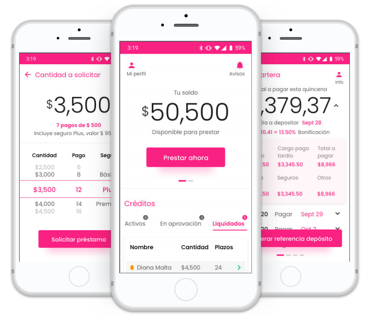
Presta&Gana offers credit products to customers who were managing everything through physical branches, balance checks, payments, transaction history, any account question. The branches were the only option.
The business problem was clear: branch staff spent most of their time on service requests from existing customers, which left almost no capacity for acquiring new ones. The cost structure didn't scale.
Research
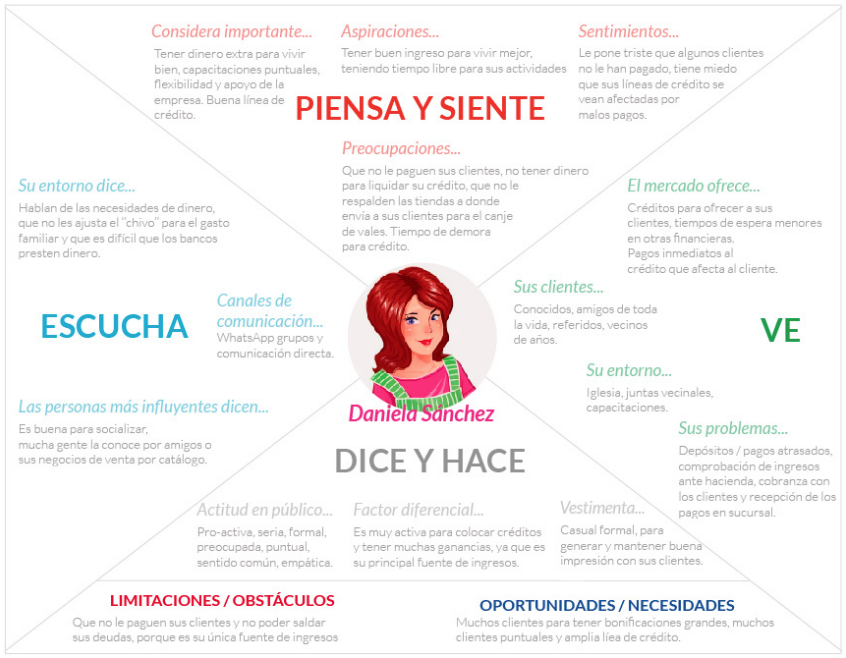
The first step was understanding who was actually using the branches and why. Two personas defined the range: a salaried employee with a smartphone who found branches inconvenient, and a customer with less digital experience who needed the app to feel as official as visiting in person.
The empathy maps confirmed something the bank already suspected but hadn't acted on: customers weren't visiting branches because they wanted to. They were visiting because there was no alternative for the things they needed to do regularly.
Three operations: balance check, payment confirmation, and transaction history, covered most of the branch visits. The app didn't need to do everything. It needed to do these three things reliably.
Digital skepticism wasn't about technology. Users trusted their phones for other things. The hesitation was about unfamiliar interfaces in a context where mistakes felt consequential.
The branch interaction carried trust signals that a generic mobile app wouldn't: a receipt, a confirmation from a person, a familiar format. The design needed to replicate those signals, not replace them.
Definition
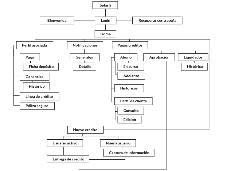
With the research done, the task analysis produced the product scope. The goal was to map every step users took for the three core operations and find where steps could be removed.

Design constraint
One tap from the home screen to start any of the three core operations. If it required more, we hadn't simplified enough.
Exploration
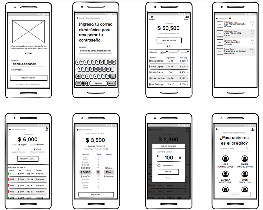
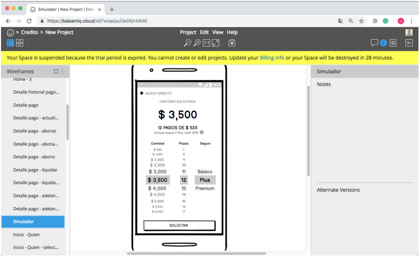
Lo-fi wireframes explored the structure before any visual decisions. The focus was on sequencing: what information appears at each step, what action is possible, what happens when something goes wrong.
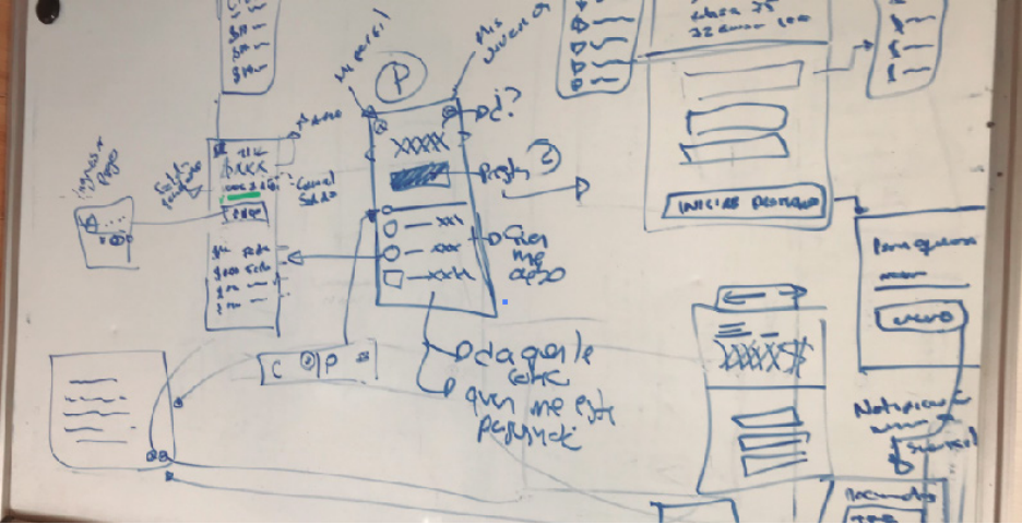
Lo-fi is the most useful phase for catching structural problems. Moving to high fidelity too early hides architecture issues behind visual polish.
Design
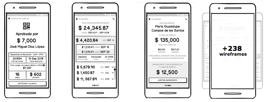
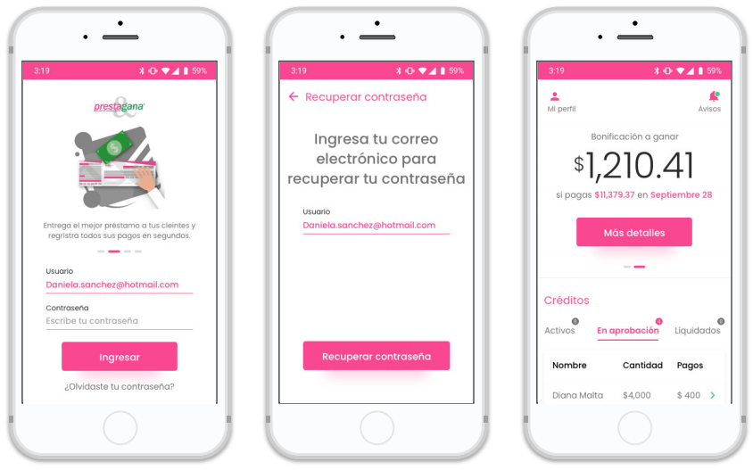
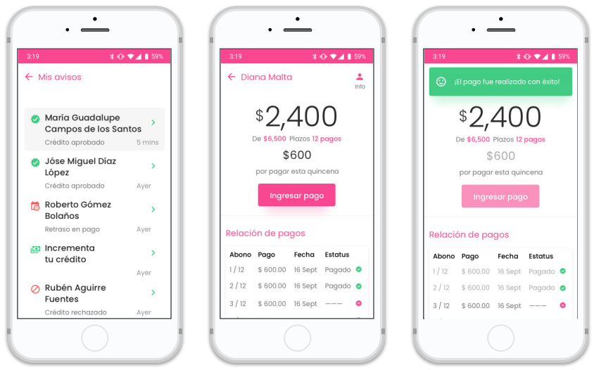
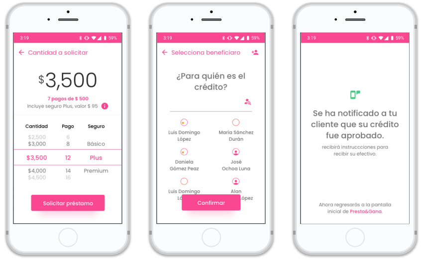
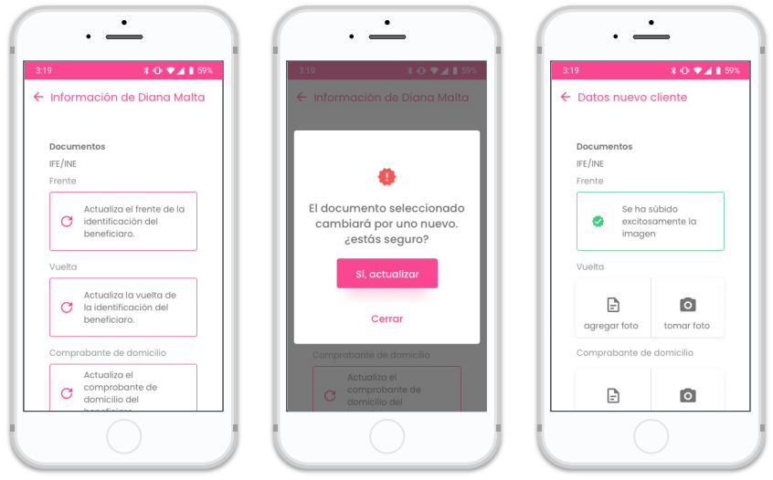
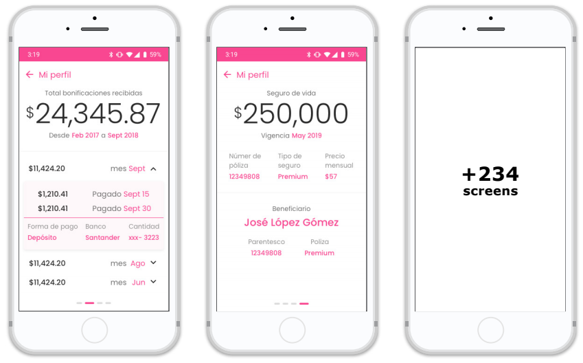
High-fidelity wireframes followed the lo-fi structure closely. The visual layer added the trust signals the research had flagged as necessary: clear confirmation states, familiar receipt-style layouts, explicit security indicators at sensitive points.
Wireflows
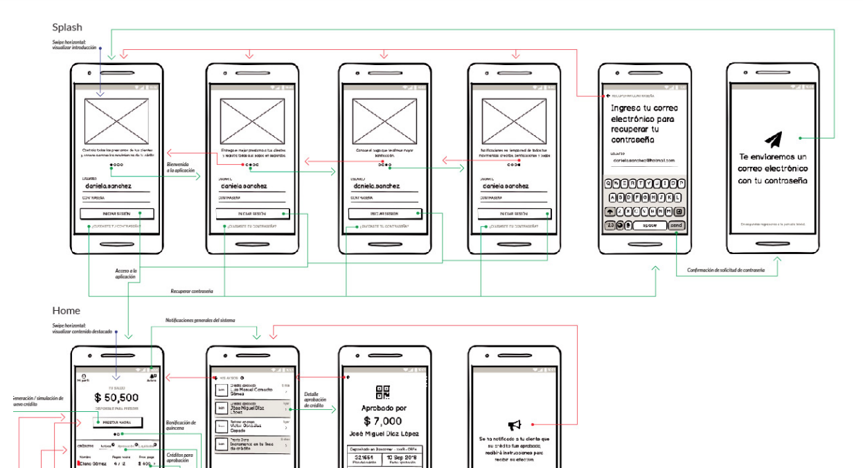
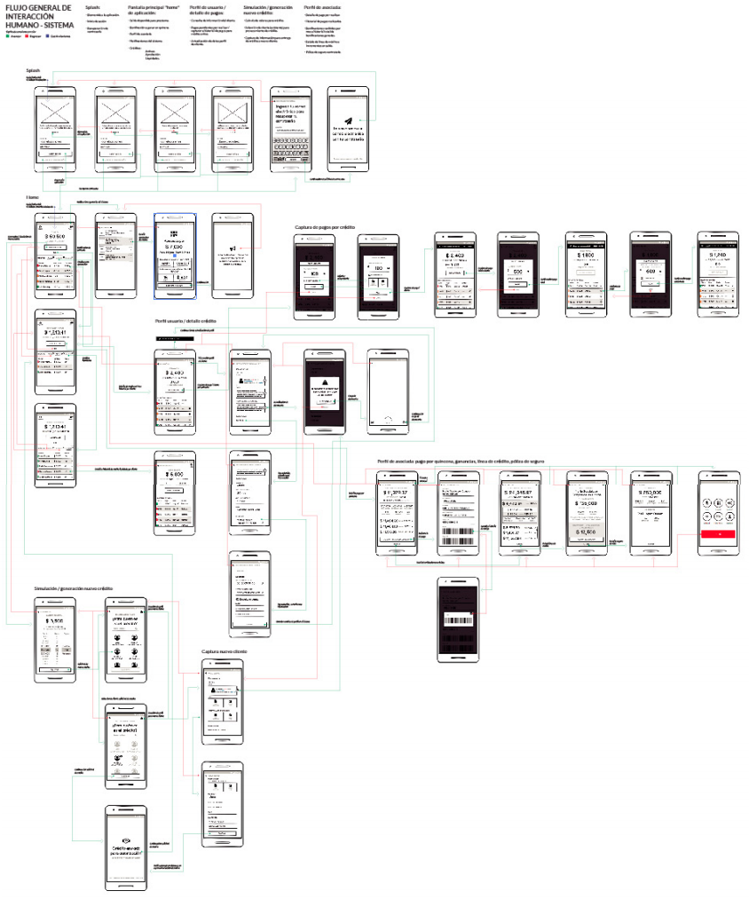
Wireflows were the most important artifact in this project. They mapped the full logic behind each flow including dynamic content states, error paths, and edge cases that sketches don't surface. Most of the actual design decisions happened here, not in the visual screens.
What the wireflows revealed
The information architecture was simpler than expected. But the confirmation screens needed significantly more detail than standard mobile apps. Users needed to see exactly what happened, in terms that matched what a branch receipt would say.
Validation
The prototype was tested with real users from both personas. The tests confirmed the task flows worked. They also revealed one gap that wasn't visible in the wireflows: error states were too minimal.
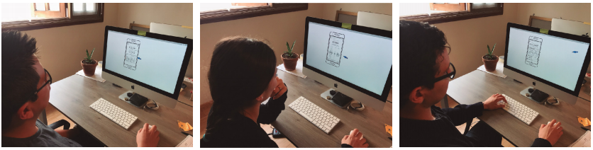
Task completion was high for all three core operations. Users could check balance, make a payment, and view transaction history without assistance.
When a payment failed, users didn't know if they had made a mistake or if there was a system problem. The error states were too generic. This was fixed before handoff.
Testing principle
If users can complete all specific tasks in the prototype, you've found a real solution to the actual problem. Everything else is iteration.
Outcome
The final product went from research to validated UI in 20 days. Customers could handle all routine account operations from their phone. Branch visits for service requests dropped, and staff shifted toward acquiring new clients, the original business objective.
Organizational impact
The bank didn't need to hire additional staff to handle service growth. The product absorbed the volume. Staff that previously handled service requests shifted toward new client acquisition, the goal the bank had stated from the beginning.
Reflection
The 20-day constraint wasn't the hard part.
The hard part was building trust in a context where mobile banking wasn't the default. The research made that clear early: customers didn't distrust mobile technology, they distrusted unfamiliar interfaces in high-stakes situations Making the app feel like the branch, not like a generic app, mattered more than any feature we could have added.
The wireflows were where the real design happened. The visual screens followed from decisions made there.